It seems so simple, but contrast in color really is a thing for color work projects: one combination of colors can very much differ from the other. One aspect of color theory in relation to knitting and crochet consists of the contrast of the colors chosen. You can go for big contrasts, or just for subtle differences if you so desire.
But how can you tell what kind of contrast you have with the yarns and colors chosen?
Luckily there is a very handy trick to determine whether a particular color combination has big contrast or only a little. To do so, just take a photo of the yarns together and make the picture black and white!
Take for example the yarns below, quite different from each other, don’t you think?
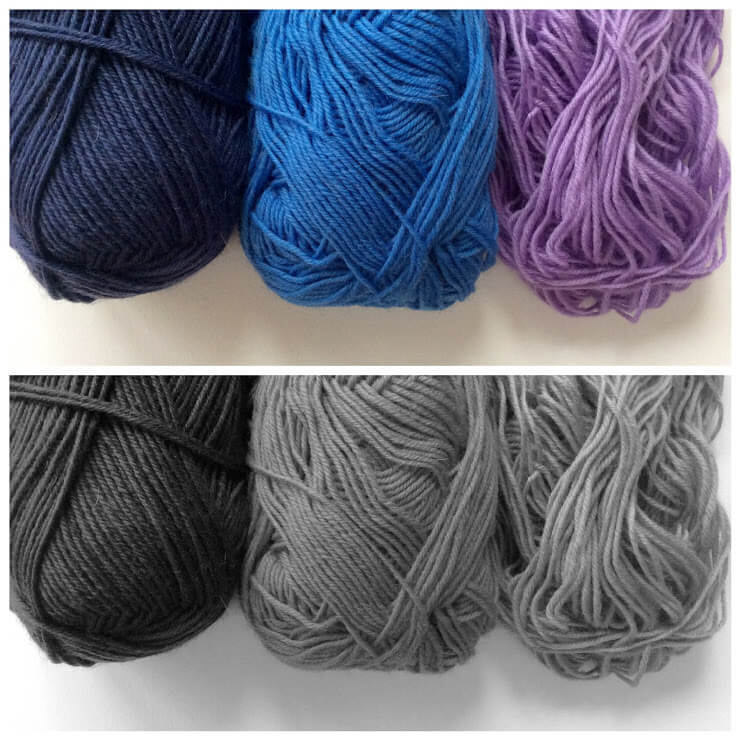
The black and white version, however, tells a different tale!
It turns out that the light blue version combined with the lilac hardly differ in contrast. This means that when you combine both in a project, the colors won’t really “pop”. An excellent choice, if that is your intention. If on the contrary a lot of contrast is desired, the dark blue combined with the light blue or the lilac would be a far better choice.
Try finding the contrast in color out for yourself!
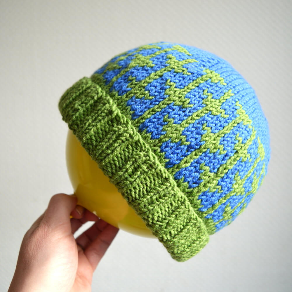
Want to try some simple color work yourself? Take a look at the Pijl hat (also pictured above) and the Bloem hat!
")


